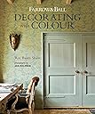
Farrow & Ball Decorating with Colour
Product ID: 296199736
Desertcart purchases this item on your behalf and handles shipping, customs, and support to Philippines.
Interiors fashions come and go, but iconic British brand Farrow & Ball transcends passing trends and has become a byword for its sophisticated wallpapers and highly pigmented paint. Following on from the best-selling Farrow & Ball Living with Colour , this exciting book features a diverse range of fabulous homes. Whether a converted factory in Paris, the attic of an Amsterdam canal house, or a family home in Southern Germany, these interiors are full of fresh ideas and clever ways to use paint and wallpaper. The book is divided into three main chapters: Classical, Country, and Contemporary. Under these headings, 18 locations are presented as case studies. In addition, spread throughout are ten informative Decorating Principles, each one discussing a different decorating concept and enabling the reader to put it into practice in their own home. At the end of the book there is a glossary of Farrow & Ball’s popular neutral palettes and information on choosing the right paint for the right place. Practical, intriguing, and often surprising, this is a book certain to inspire creativity in all home decorators.
| Dimensions | 24.38 x 2.29 x 29.21 cm |
| Edition | Reissue |
| Importer | Bookswagon, 2/13 Ansari Road, Daryaganj, New Delhi 110002, [email protected], 01140159253 |
| Isbn 10 | 1788791878 |
| Isbn 13 | 978-1788791878 |
| Item Weight | 1 kg 450 g |
| Language | English |
| Packer | Bookswagon, 2/13 Ansari Road, Daryaganj, New Delhi 110002, [email protected], 01140159253 |
| Print Length | 192 pages |
| Publication Date | 10 March 2020 |
| Publisher | Ryland Peters & Small |
User
Entrega pontual
Excelente livro. thanks!
User
Arrived promptly
As described
User
Disappointing
It says colour, but sadly it is Scandinavian in style so not much colour - dim off whites and beige.
User
Inspirational book.
A beautiful book, full of inspirational images and great advice.
User
Fine inspiration. Average photo reproduction.
Lovely inspiration, but the quality of printing leaves many of the photos with a noticeable moiré pattern to the extent that flat and painted walls/ wallpapers appear textured. This contrasts with the text extolling the well recognised ‘flatness’ of F&B paints. Shame the printing was not better quality but fine for a rough idea of the schemes described.
Trustpilot
1 month ago
2 weeks ago